Emotions and Maps: A Spring School Experience
- Published on
- Authors

- Name
- Victor Ademoyero
- @vickystickz
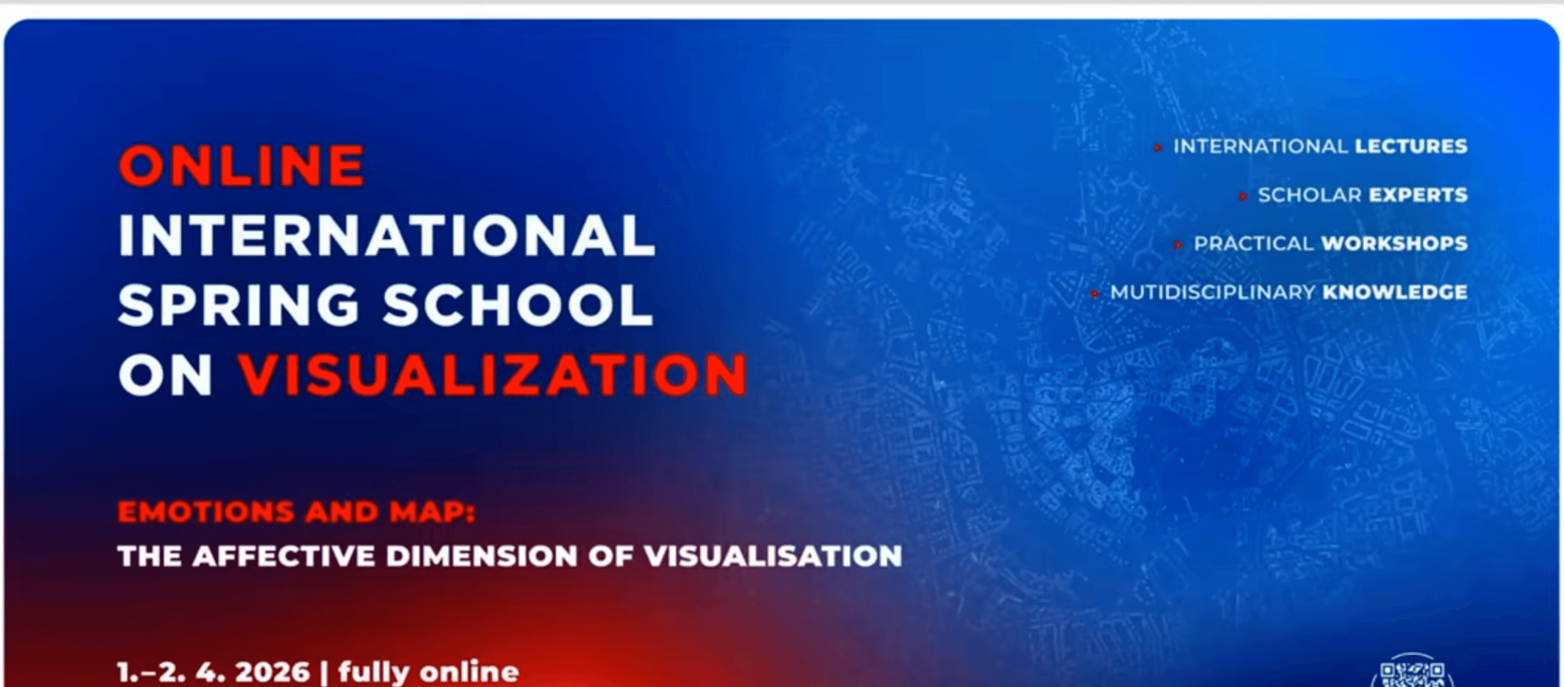
In April 2026, I took part in the online International Spring School on Visualization, hosted by the Department of Geoinformatics at Palacký University Olomouc, Czechia. This year's theme was "Emotions and Map: The Affective Dimension of Visualization," and it ran across two intensive days, the 1st and 2nd of April. The programme was awarded 3 ECTS credits under the Geospatial Summer School course.
I signed up because I was curious about a side of cartography that does not get talked about much. We spend a lot of time on accuracy, projections, classification methods and colour schemes, but far less on how a map actually makes someone feel. The Spring School put that question in front and centre, and it changed how I think about my own maps.
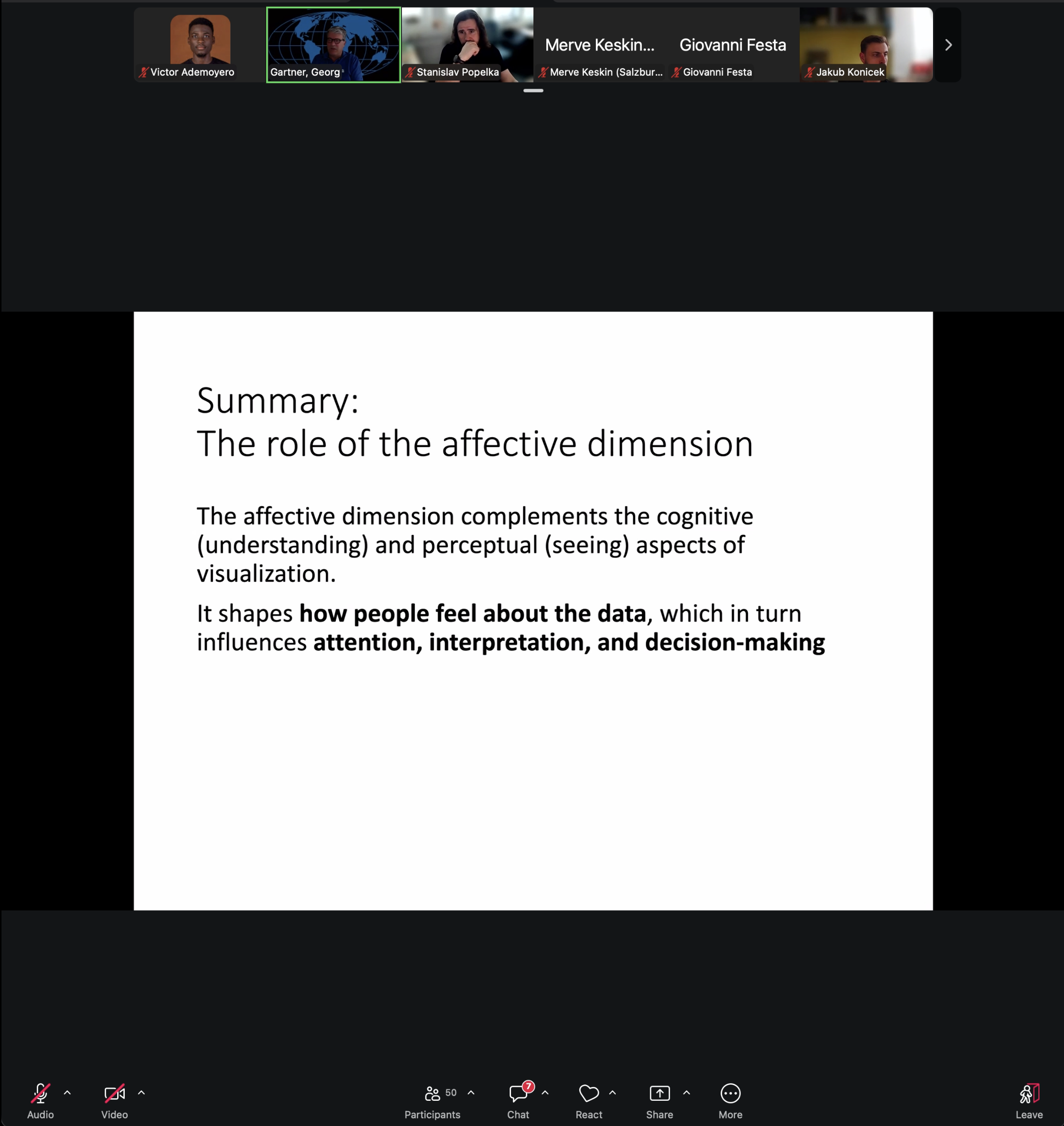
Prof. Gartner Georg's Presentation on Emotions and Map
Why emotion belongs in a map
The core idea of the school was simple but easy to overlook: a map is never neutral. The colours you pick, the chart type you choose, the way data trends upward or scatters, all of it shapes the viewer's emotional response before they have even read the legend. That response then feeds into how much they trust the map and how well they understand it. Sitting through the lectures, I kept thinking back to my own visualisations. A map I had made of imperviousness around Seetaler See, a Natura 2000 site in Austria, uses a yellow-to-dark-red scale. I had picked it for contrast and readability. The school made me realise that the same scale also carries a warning tone, dark red reads as alarm, and that emotional cue is doing work whether I intended it or not. That is not a flaw, but it is a choice I should be making on purpose rather than by habit.
The sessions that stuck with me
A few of the recorded talks were especially useful, and I have gone back to rewatch them since the event:
- A session on eye-tracking and how people actually read maps, which connected directly to the organisers' own research at Olomouc. It made the case that we can measure attention and reaction rather than just guessing at them.
- A talk on the affective dimension of visualisation design, which broke down how individual design elements push arousal and valence up or down. The takeaway that surprised me most: certain data characteristics shift a viewer's emotion even when the data carries no real meaning.
- Two further sessions from the school's recording playlist that dug into practical methods for designing and evaluating emotionally aware visualisations.
What I am taking forward
The biggest shift for me is treating emotional impact as a design variable, something to plan for, not a side effect to ignore. For the maps I build going forward, I want to ask one extra question before I export: what does this make the viewer feel, and is that the feeling the data deserves? The Spring School was online, compact and genuinely worth the two days. It pointed me toward a research area I had barely considered, and it gave me a vocabulary for things I had only sensed before. I would recommend it to anyone working in geoinformatics or data visualisation who wants to think harder about the human on the other side of the screen.
Final thoughts
Overall, the Spring School was a great reminder that maps are not just tools for conveying information, but also powerful emotional artefacts. As I continue to develop my skills in cartography and geovisualisation, I will be keeping the lessons from this school in mind, striving to create maps that are not only accurate but also emotionally resonant and engaging for users.
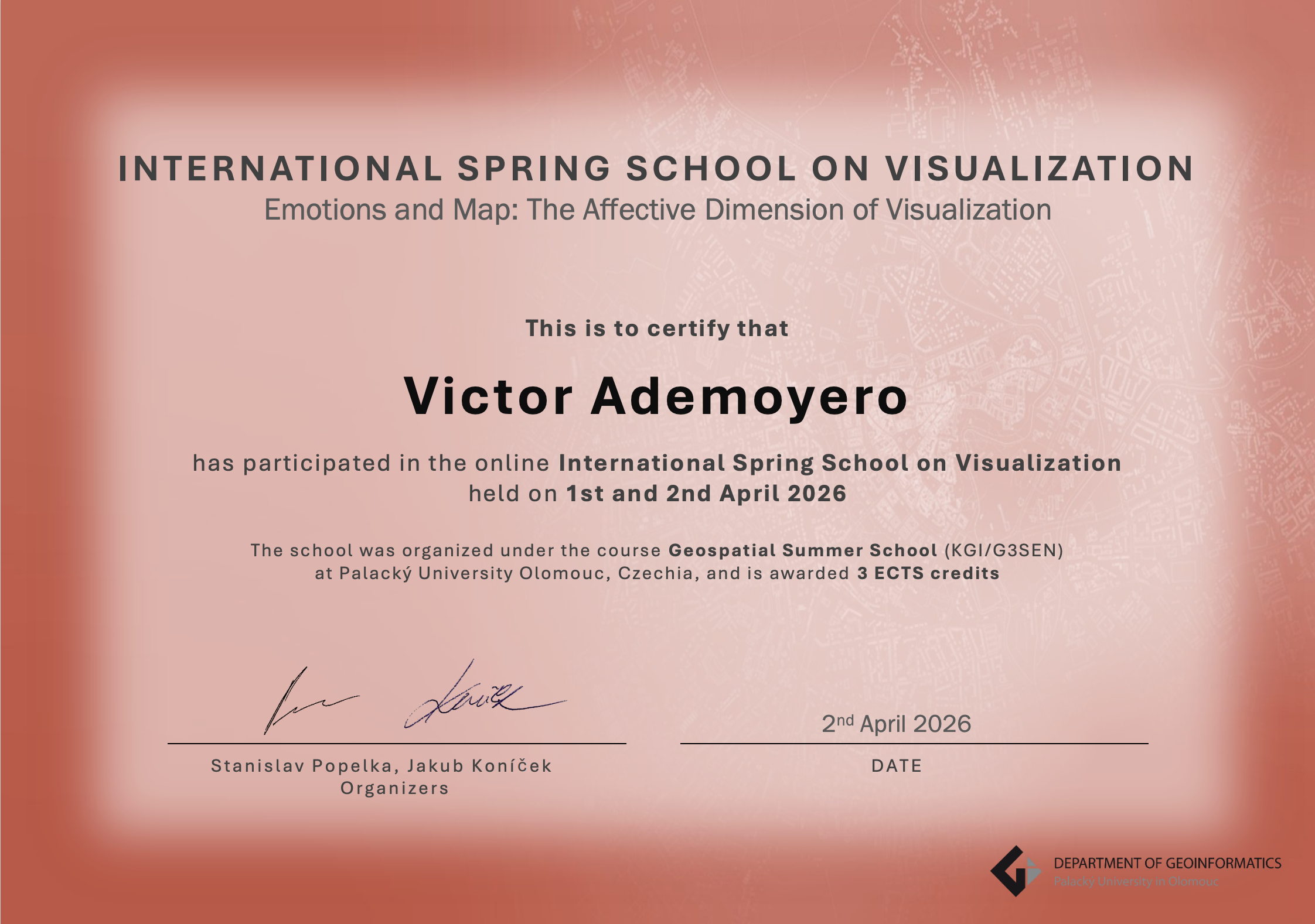
Spring School Certificate